2024

ATLANTIS AGRI -A premium brand identity for sustainable tomato farming

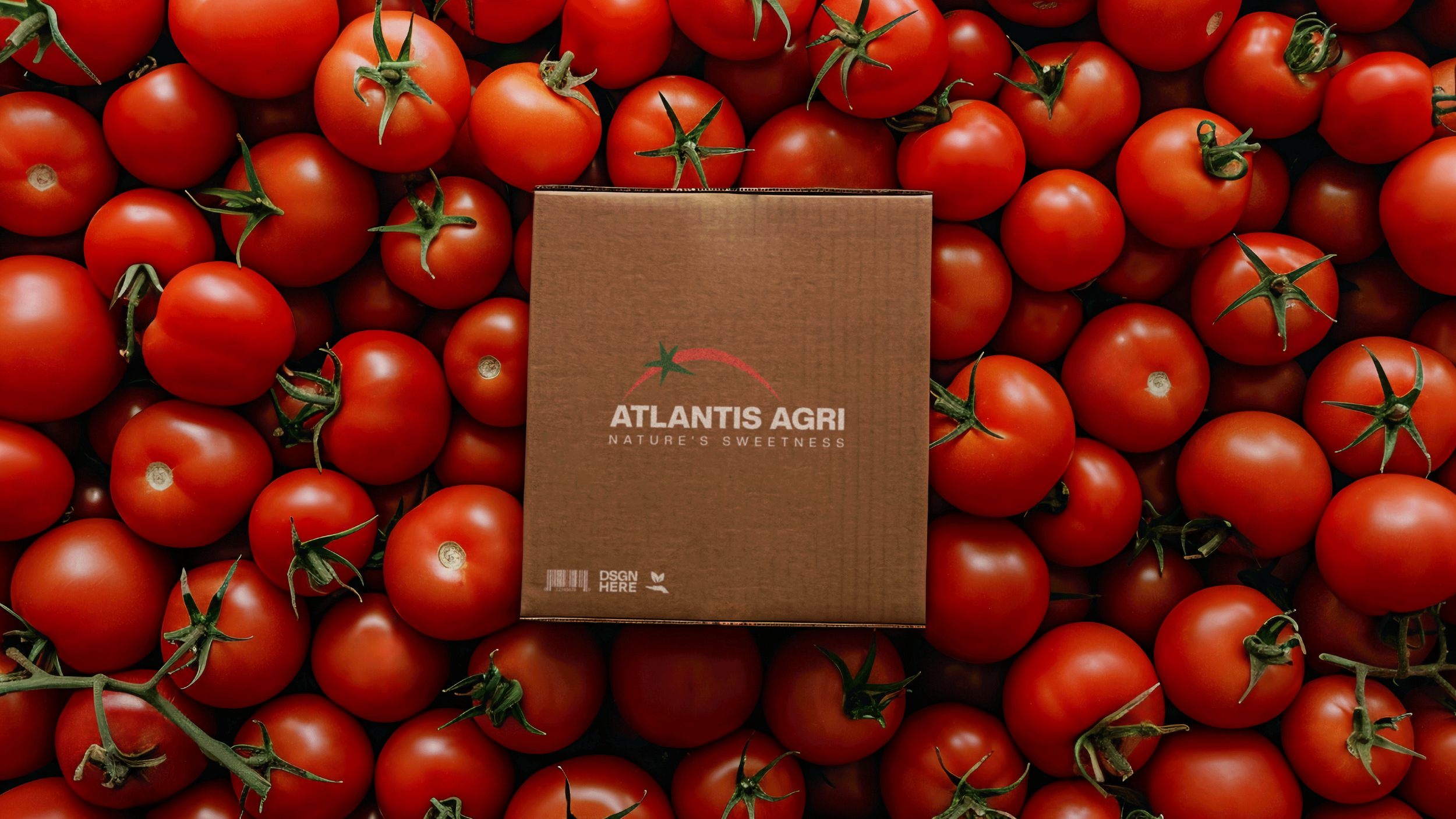
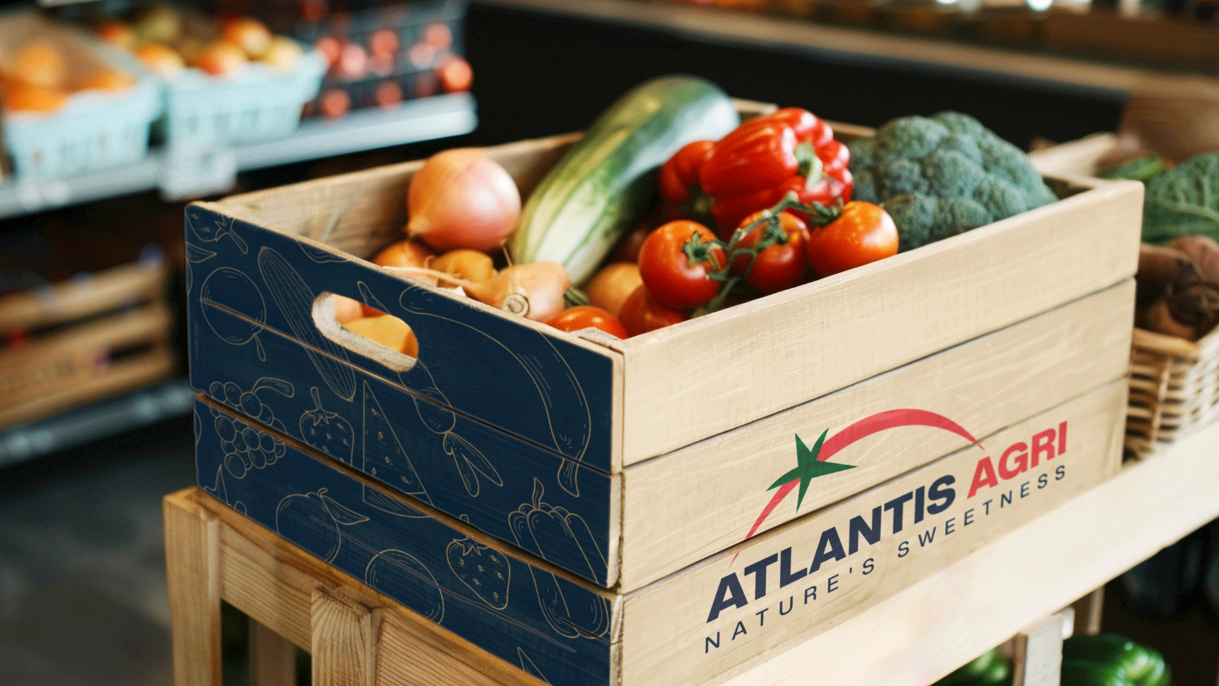
ATLANTIS AGRI needed a strong visual identity to establish itself as a trusted cherry tomato supplier for UK and European retailers. As a brand with no prior identity, the challenge was to create a modern and professional look that reflects its premium quality, sustainability, and reliability.

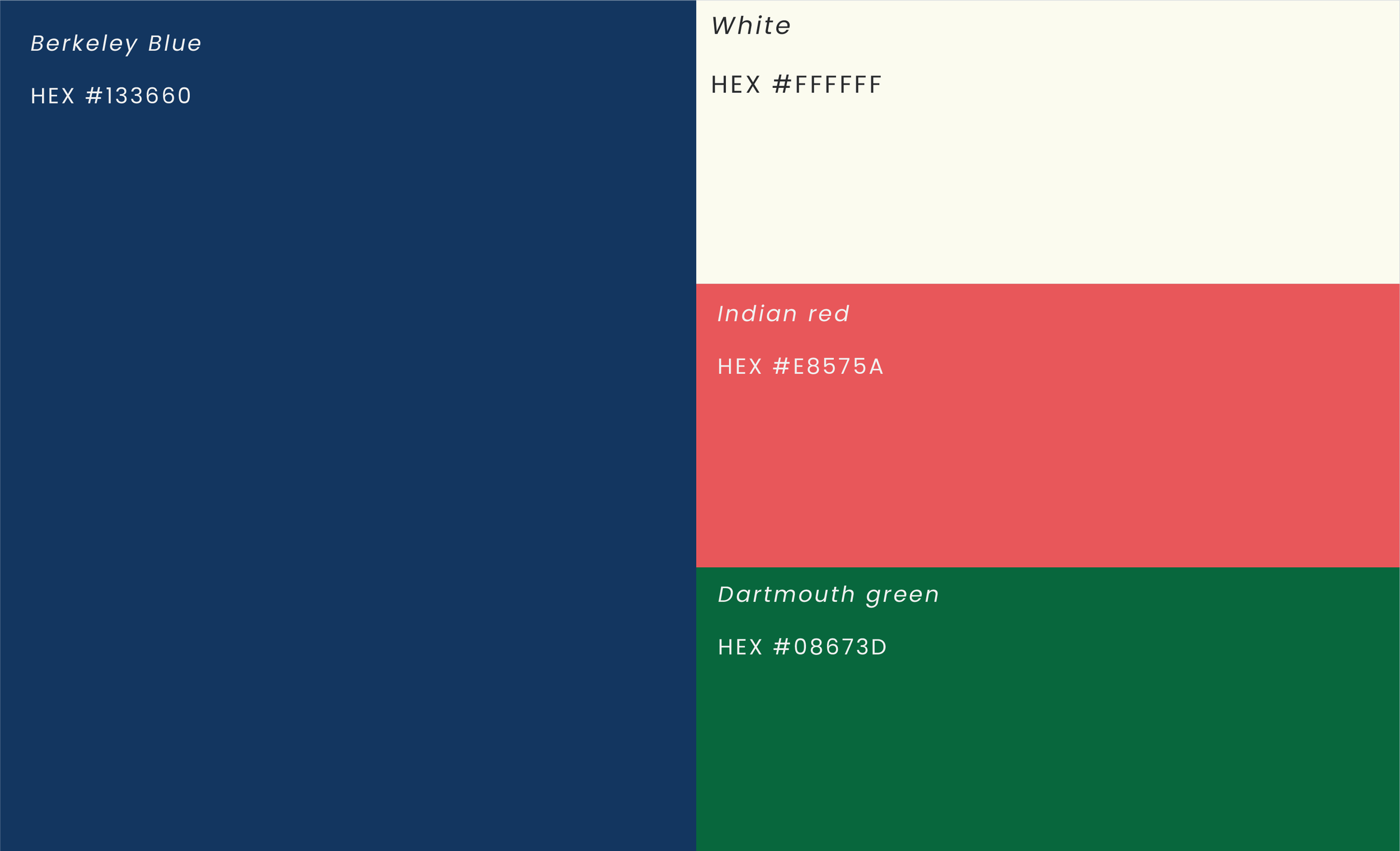
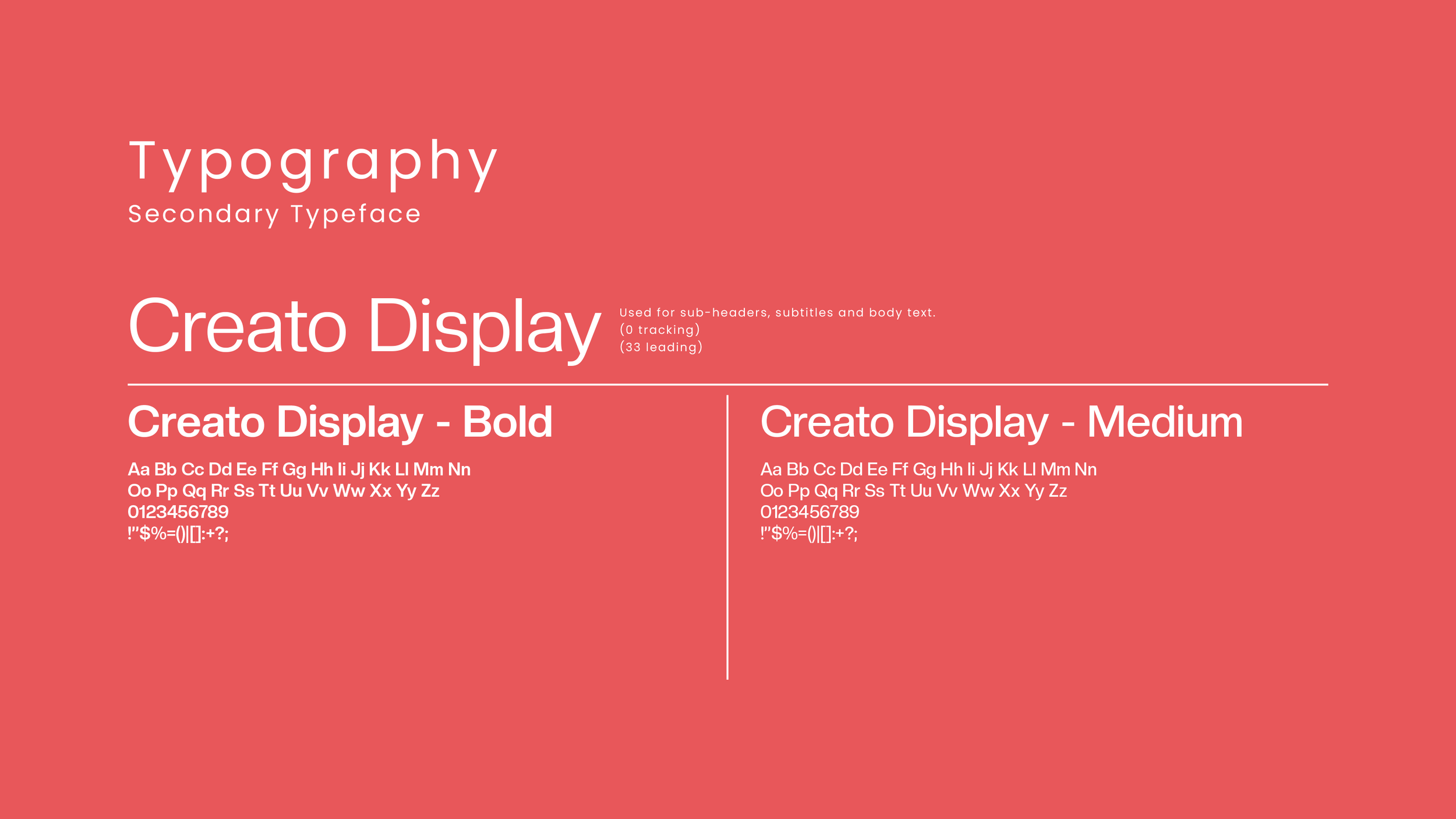
The solution included designing a brand new Identity including a logo, typography, and color palette, ensuring a cohesive and recognizable brand presence. This new identity helps build credibility, attract direct retail partnerships, and position ATLANTIS AGRI as a leading name in high-quality tomato farming.

Brand Identity Design

Visual Identity & Branding

The logo features a sleek and modern design, highlighted by a vibrant red arc paired with a distinctive green leaf, symbolizing a cherry tomato. The green leaf is cleverly stylized to include a five-pointed star, echoing the design of the Moroccan flag, which not only signifies the product's Moroccan heritage but also emphasizes its local authenticity. The curvature of the red arc suggests the global aspirations of the company, representing the cherry tomato in a form that resembles a globe. This minimalist composition uses the colors red and green to vividly represent the freshness and natural quality of the cherry tomatoes, aiming to convey the brand's commitment to expanding its reach worldwide while staying rooted in sustainable practices.

Colors

Previous
Previous

Sokitrans Logistics

Next
Next

Afwa Meals