2024
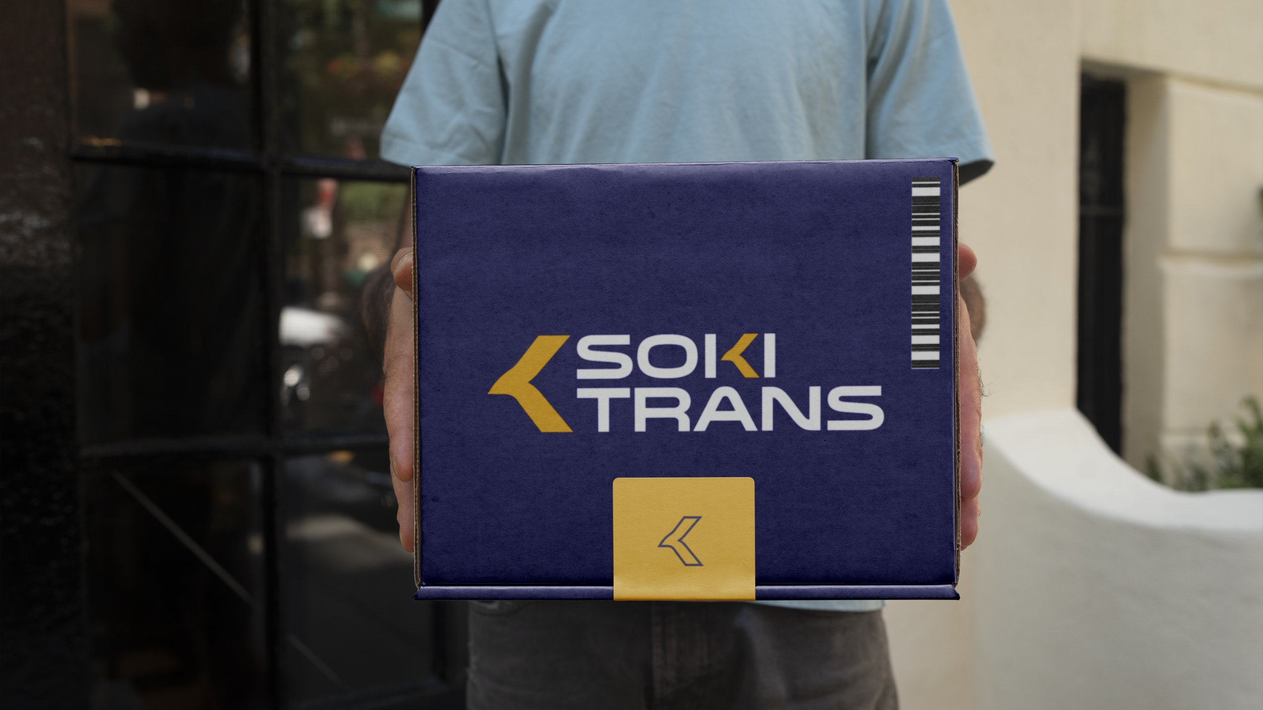
SOKITRANS - Bold. Modern. Moving forward.
SOKITRANS needed a bold and professional visual identity to establish itself as a trusted logistics provider specializing in cross-continent transportation between North Africa and Europe. With a decade of experience, the company required a brand that reflects its speed, reliability, and expertise in handling fresh produce and agricultural supplies.
The solution included designing a modern and dynamic logo, complemented by a strong typography system and a strategic color palette. The combination of deep navy blue for trust and gold accents for efficiency and excellence ensures a cohesive and recognizable brand presence. This new identity positions SOKITRANS as a dependable partner for farmers and business owners, reinforcing its commitment to delivering goods safely and on time across borders.


